For me, Palm was the one that got away. I don’t exactly remember what made me buy my Palm V but for the life of pocket organizers, nothing ever supplanted it. After a year and a half long stint with the Palm V I tried moving to a bunch of Pocket PC based organizers. The iPaq was the most recognizable of them all, and it seemed like as functionality went up, usability decreased.
I went through a ridiculous number of PDAs but none ever came close to being as useful for me as my old Palm V. I could play music and movies on the newer ones, but I never used them as religiously as I did the old V. I’m not sure what it was, but Palm got the UI right for keeping my notes and calendar organized. As cumbersome as the handwriting recognition seems to me today, back then I was very fast with it - it just made sense.
To be honest, it wasn’t until the iPhone that I ever truly got over my Palm V. When I heard that Palm was brewing an iPhone competitor, it seemed fitting.
This is the Pre:
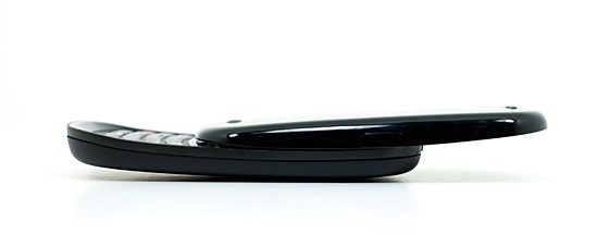
And while it won’t destroy the iPhone, it will land more than a few blows to the smartphone posterchild. In my opinion, it’s the first real alternative I’ve seen since the iPhone launched.
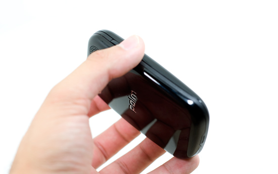
The Pre is unlike any device Palm has ever produced. Sure it delivers the same functionality as many Palm products, but it shares more in spirit and soul with the iPhone than any other Palm product or than the iPhone does with any other smartphone.
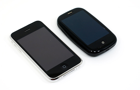
The Apple iPhone 3G (left) vs. The Palm Pre (right)
Palm created a brand new OS, which I’ve often said is the right way to approach a brand new device; one size fits all just doesn’t work outside of hats. It’s Linux based and is called webOS. It’s designed to be controlled via a touch screen using gestures and is ultra lightweight. Sound familiar? Did I mention that a former, kind of super important, Apple guy spearheaded the effort behind webOS and the first phone based on it?
Minimalism for the Masses
When the iPhone first hit, the fact that it only had four buttons was huge for a smartphone. The Pre echoes Apple’s design philosophy and features a similarly simple approach. When closed there are only 4 physical buttons on the device (5 if you count the volume up/down buttons separately).
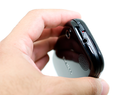
At the top of the device you have a ringer switch and a sleep/wake button, just like on the iPhone.
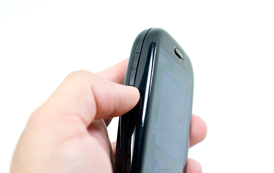
The left side of the Pre has a volume up and down button.
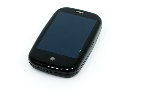
On the face of the Pre, near the bottom, you have a home button.
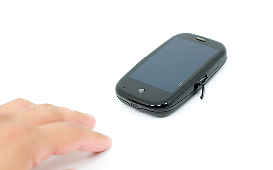
On the right side is a micro-USB port for charging and syncing the device.
Everyone says the Pre is plasticky. Well, it is made out of plastic. The build quality isn’t great, compared to the iPhone that is. Compared to most other phones the Pre is quite good.
Part of the problem is that Palm (and most other companies) isn’t as good at making things feel indestructible as Apple. The other part is that the Pre has a slide-out keyboard; it’s difficult to make a lightweight product with moving parts feel solid. The Pre is decent in this respect, but the part that houses the screen and the part that houses the keyboard will wiggle a bit, independently, when the Pre is closed.
Even the individual buttons on the Pre don’t feel as good as those on the iPhone. The ringer and sleep switches both feel cheap.
The Pre also doesn’t seem like it would take a fall too well. Granted I’ve seen cracked iPhone screens, but the construction of the Pre doesn’t feel all that sturdy. A tough Blackberry, the Pre is not. For Palm, this is most likely a learning experience as well as a cost balancing act. Palm will get better at making these things, but the cost side is difficult to deal with.
Overall the Pre looks good but it just doesn’t feel as good as it looks unfortunately. Again, if your comparison point is the iPhone you’ll be disappointed. If it’s any other phone, you won’t be.


91 Comments
View All Comments
TheProf - Saturday, June 20, 2009 - link
That's because to most non-PhoneGeeks, a good interface to a feature is more important than the feature itself. Usability trumps power in most if not all cases.If a feature is too hard to find or too hard to use, it might as well not exist, for whatever values of 'too hard to find' or 'too hard to use' apply. "pack[ing] as many features into a phone to make it a powerful device" may appeal to tech geeks, but it doesn't fly with the broader computing audience, let alone the general public.
That's the true overriding 'feature' of the iPhone and the Pre; they take features that existed in previous phones, but were so complicated that hardly anyone used them, and made them things that a much broader audience actually *enjoy* using.
cplusplus - Friday, June 19, 2009 - link
Now I'm not actually expecting a G2 review at any point, but Android is only brought up twice in this whole review? The G1 has been out for 8 months and already pulls from the cloud (Google natively, and I believe it can pull from Facebook) and has multi-tasking. Two of the things you say you really like about the Pre. The G1 isn't as good as the iPhone (for the most part), and I know that, but the G2 is supposed to be much better, and I would like to see how Android stacks up against webOS, at the very least.Anand Lal Shimpi - Friday, June 19, 2009 - link
I played with the G1 while writing this review, while I think the OS has some definite promise - the current hardware is just disappointing. Multitasking has been around long before any of these phones, yet it was the Pre's interface and relative quickness that made it a very desktop-like experience. The next-generation of Android based phones will hopefully deliver a full set of gestures and better performance; I think that would be the appropriate time to look at a comparison.To my knowledge, Android doesn't natively handle Facebook integration and has no mechanism for removing dupes between Gmail/Facebook contacts on the fly. Google (Android) is closer than anyone else (other than Palm) right now though.
Take care,
Anand
mrhumble1 - Friday, June 19, 2009 - link
This is kinda disappointing, Anand.You are saying the G1 doesn't cut it simply because of Facebook integration??
Newsflash... plenty of people (and phone geeks) don't care one bit about Facebook. That's a terrible reason to knock the G1.
As for hardware, the G1 shouldn't be judged only for its hardware. The G1 is all about Android.
The G1 has PLENTY of functionality that most review sites completely ignore. Does the iPhone (or Pre) have widgets? Do either of these phones have skins/themes/ or home screen replacements that include custom icons/backgrounds? These features greatly enhance the customization/usability options of the phone yet nobody seems to care.
I use apps every day on my G1 that Apple would never allow on the iPhone. The Pre may have great synching capabilities, but it has a similar notification bar like the G1 yet nobody gives the G1 credit.
You say the Pre gives a better "desktop experience" but the G1 is EXACTLY like using a laptop. I have the icons where I want them, I use the app tray like the Start button (XP), I have shortcuts to every function I could want, and separate home-screens for each category of app (Home, Settings, Games, Contacts, Multimedia, etc.), I have widgets set up on the various screens that provide me with information and functionality (from weather to wireless settings)... the list goes on. I haven't even mentioned the browsers which are excellent.
I often jog with my G1. Here's what it does for me:
-I open one app that plays streaming internet radio (over stereo bluetooth)
-I turn on the GPS and use another app to track my workout. The app reads back my elapsed time and distance aloud so I don't have to interrupt my music or look at the phone to check my stats. Then, when my run is done, it uploads the info and emails me a summary of my workout which includes a map and detailed stats regarding time and distance.
Can the iPhone/Pre do that? The iPhone can't even run 2 apps at once!
Android is not a small player in this game. Let's give it a little more credit, ok?
J
Anand Lal Shimpi - Friday, June 19, 2009 - link
I think this is the key point we differ on:"As for hardware, the G1 shouldn't be judged only for its hardware. The G1 is all about Android. "
I agree that the G1 is nothing without Android.
I agree that Android is extremely important.
But where we disagree is the value of the hardware. In my eyes, the G1's hardware keeps it out of the running for the top places. It lacks all of the major gestures that the iPhone and Pre support and the UI/device is much, much slower.
Many PCs can run an impressive set of applications, but what we're looking for is the right combination of features and performance - the latter just isn't delivered by the G1. I do fully expect future versions to fix that however, I just don't believe the time is now. And I believe most of the reviews of the G1 echo my sentiments; the hardware doesn't do the software justice.
Take care,
Anand
cplusplus - Sunday, June 21, 2009 - link
Just as a quick reply, the only reason Android doesn't have multi-touch is because they were afraid they would get sued by Apple for having it. Everyone was. It's not big news/problem because since Palm has been in the PDA game much longer than Apple, they have patents that Apple are probably infringing, too. There are cooked roms out there that show that the G1's screen is fully capable of multi-touch. Now that Palm has shown that it can be implemented without being sued, I fully expect it to show up in the 2.0 version of Android.http://gizmodo.com/5150354/apple-stopped-multitouc...">http://gizmodo.com/5150354/apple-stoppe...-on-andr...
http://i.gizmodo.com/5146797/how-to-hack-android-f...">http://i.gizmodo.com/5146797/how-to-hac...itouch-w...
http://www.engadget.com/2009/01/28/apple-vs-palm-t...">http://www.engadget.com/2009/01/28/apple-vs-palm-t...
Griswold - Friday, June 19, 2009 - link
"Even the individual buttons on the Pre don’t feel as good as those on the iPhone. The ringer and sleep switches both feel cheap."But does the ringer switch fall off as easily as the one on my iphone? Personally, I dont care if some parts feel or look cheap, as long as they arent cheap - like the ringer switch on the iphone.
joos2000 - Sunday, June 21, 2009 - link
[quote] Pinch two fingers to zoom in, move them apart to zoom out.[/quote]Certainly it is the other way around?
aileen - Friday, July 3, 2009 - link
It is indeed a great resource to obtain information on this subject. Keep posting. Thanks.http://www.freshsmileclinic.co.uk/dental-implant-d...">http://www.freshsmileclinic.co.uk/dental-implant-d...
http://www.freshsmileclinic.co.uk/brighouse-dental...">http://www.freshsmileclinic.co.uk/brighouse-dental...
Hrel - Tuesday, June 23, 2009 - link
no, why would it be??? That would make no sense at all.>>> <<< to zoom in. <<< >>> to zoom out. How does that NOT make sense?