Nokia N8 Review: Nokia's New Flagship
by Mithun Chandrasekhar on January 12, 2011 1:00 AM EST- Posted in
- Smartphones
- Nokia
- N8
- Symbian
- Mobile
I remember one of the first mobile phones I ever used being a Nokia 5110i. It was among Nokia’s earliest of devices that packed an easy to use and straightforward interface in a supremely well-built package. Since we didn’t have as many phone launches each month back then as there are stars in the sky, the 5110i served me very well for more than 3 years without showing any signs of aging. That was in the mid to late 90’s.
Fast forward to the end of this decade and we see Nokia’s current flagship, the N8-00, continuing to hold on to the Nokia tradition of building what are arguably some of the best constructed mobile devices on the market. In fact in many ways, with the Nokia N8-00 (referred to as the N8 from here on) it seems as though Nokia has let its hardware and industrial design teams have a field day; this phone feels almost over engineered when held in your hands. While the current flagship demonstrates Nokia’s engineering prowess quite well, previous models seemed to epitomize what I felt was the company’s philosophy; build the software around the hardware. This worked just perfectly for as long as mobile phones were just that, devices used to make and receive calls and/or texts.
Sometime in the last decade, Apple, Google, Palm and Microsoft redefined mobile experiences, and as a result old flaws have slowly become gaping holes in the Finnish device manufacturer’s proverbial armor.
The devil is in the details…
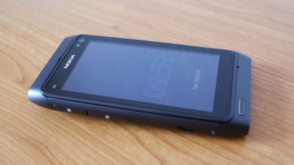
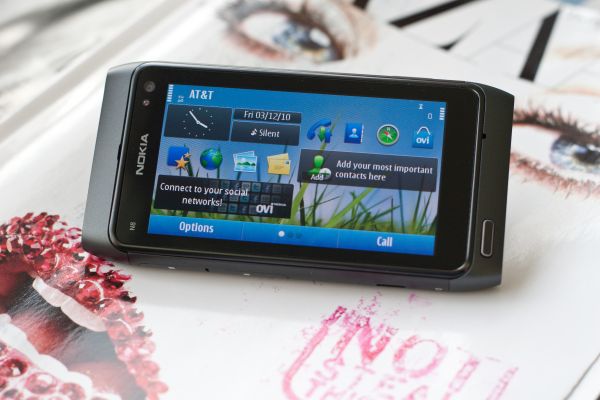
The N8’s symmetric design is attractive in a very understated manner. It won’t immediately grab your attention in any way if you look at it. The 3.5” 640 x 360 AMOLED screen commands the majority of the real estate on the front with tapering edges on all 4 corners. The menu/home button at the bottom left corner is the only detail on the face of the phone which narrowly saves the N8 design from being branded bland.
While the button did seem a bit oddly placed when I first saw it, the overall profile and weight distribution of the phone didn’t lead to any issues in actual use (although left-handed users may disagree).
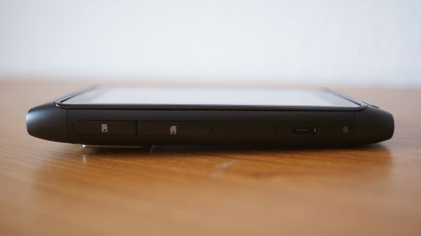
Upon closer inspection, you will find the front facing VGA camera, the ambient light sensor and the proximity sensor sitting behind the (Gorilla) glass on the top right corner. The left side houses a well-constructed but tad finicky and plastic “suicide” door of sorts to cover the microSD and SIM card slots. There’s also a multifunction micro-USB port (more on this later) and a charging light indicator. The right side seems a bit busy with the volume controls, a spring loaded screen lock button and a 2-stage camera shutter button. This is the only part of the phone that I have issues with, when it comes to design. The volume controls have a lot of play and don’t give good feedback when pressed. The spring loaded screen lock button, while a good idea in itself, is not well placed. On multiple occasions, I kept hitting the volume button while attempting to lock the phone.
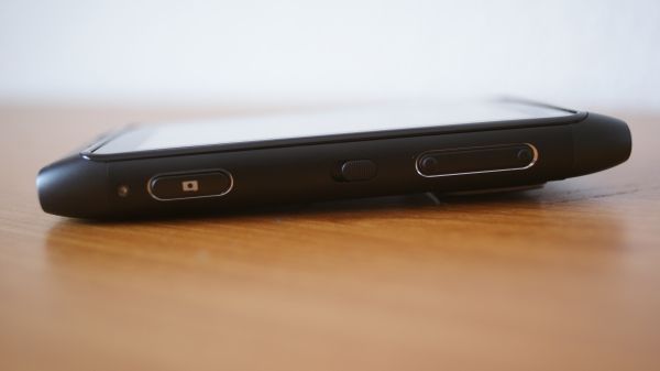
The left and right sides of the Nokia N8. Notice how it cannot lay flat on its back.
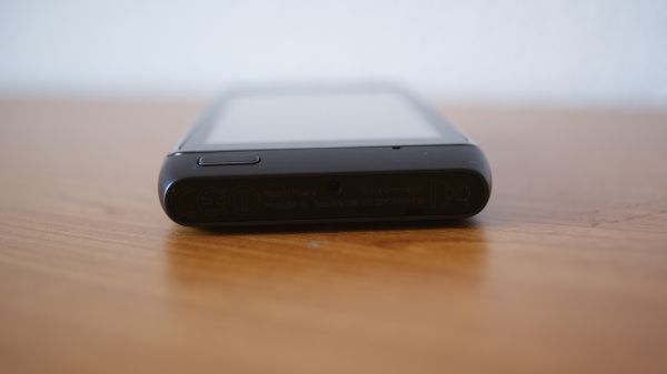
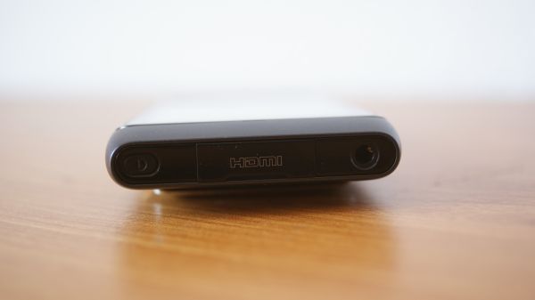
The top of the phone plays host to a 3.5mm jack (that can also serve as an AV-output if used with the appropriate connector), and a mini-HDMI port hidden behind a plastic flap and the power/profile selection button. At the bottom you will find a lone connector for your charger, although it could easily pass off as a microphone because of its placement and size, along with a lanyard or strap port.
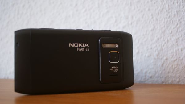
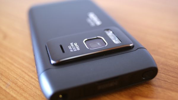
The rear of the phone prominently shows the N-series branding and houses the crowning jewel of the N8; its 12MP Xenon-flash assisted autofocus camera. Because of the complexity of the camera module and the associated optics used in the N8, the camera itself (along with the loudspeaker) is housed in a bulge, and as a result the phone cannot lay flat on any surface. While that in and of itself isn’t an issue, what concerns me is the possibility of excessive visible wear appearing on the lower part of this bulge as it is the only part of the phone that comes in contact with any surface when the phone is made to rest on its back.
Also, something I did notice was the fact that just within a week of use, dust started accumulating in the crevice between the top of the bulge and the back of the phone.
While the design may get mixed feedback, what will garner unanimous praise is the build quality and overall construction of the device. The unibody N8 is constructed of anodized aluminum and has a smooth, matte-like finish to it. It is available in Orange, Green, Blue, White and Gray – which as you can tell was the color of our review unit. While not as grippy as the soft touch rubber finish that some devices come with, it is light years ahead of the cheap, glossy black plastic that clads a lot of phones these days. Also, by design, the aluminum back of the N8 acts as a heat dissipation surface. So with prolonged use, it does get a bit warm…but nothing toasty. Another reason why the phone feels so well put together is because Nokia has taken a leaf out of Apple’s design book and gone ahead with a non-user replaceable battery, and hence eliminated the need for a battery opening in the N8 chassis. But reports seem to suggest that the battery isn’t all that hard to get to and replace, should the need arise. So those exposed torx screws aren’t just for show…




119 Comments
View All Comments
codedivine - Sunday, January 16, 2011 - link
Hi, I got a score of 8995 on a Nokia N8. Were you running Opera 10.1 or were you running Opera 10.0? I am running 10.1.Voldenuit - Sunday, January 16, 2011 - link
Good point.I ran Rightmark Browsermark on Opera 10.0 and got 5797 points.
I ran it again with Opera 10.1 and got 9790 points.
That's a 68% improvement!
NB: The Ovi store lists Opera 10.1 on its store but actually hosts 10.0. To get 10.1, I had to manually download it from Opera.com.
Voldenuit - Sunday, January 16, 2011 - link
Running Sunspider on Opera Mobile 10.1 netted me a result of 10,841ms, which is 10x faster than the 10.0 result and comparable to iPhone4 performance.Definitely worth updating the article to reflect this, as it greatly changes the performance perspective of the phone.
noxplague - Sunday, January 16, 2011 - link
Holy crap you are right! I've been using 10.0. I just trusted the OVI store. Nokia should really fix this.Thanks for sharing!
mythun.chandra - Monday, January 17, 2011 - link
I downloaded Opera Mobile "10.1" from the Ovi Store. After seeing codedivine's comment, I checked up and it is indeed version 10.0! Why Nokia would do something like this...I'm not sure.I will re-run the Opera Mobile tests and hopefully the numbers in the article should be updated soon enough.
Thank you for pointing this out! :)
mythun.chandra - Monday, January 17, 2011 - link
Updated! :)Voldenuit - Monday, January 17, 2011 - link
Nice.Perhaps you could update the title with an '(UPDATED)' tag so people who're curious can revisit the phone? I fear that the phone's reputation has been badly damaged by the initial results showing it at the bottom of the pack.
Voldenuit - Monday, January 17, 2011 - link
PS I still think there's something funny going on with the talk time and wifi throughput figures. codedivine once mentioned to me that he got 6.5 Mbps on his N8 over wifi, which was already saturating his connection.sumeetm90 - Sunday, January 16, 2011 - link
I have been using N8 for a month now and have discovered following pesky issues:1) You cant mark multiple messages in your inbox. If you want to delete say 10 messages in a go you need to individually delete them. (Dont understand how can nokia make such a blunder)
2) Cannot utilize full screen to view pdf documents in Adobe reader provided by nokia. This is really ridiculous. You are forced to use 75% of the available screen to read pdfs.
3) I was surprised to find that there was no stopwatch feature included with the new phone. Yes you can download an app but when I pay Indian rupees 23600 (approx $500) for a smartphone, I expect nokia to put a stopwatch/countdown timer in phone.
4) You need to download a scientific calculator. The default calculator is pretty lame and embarrassing. If you search the ovi store you will realise it is not so easy to download a scientific calculator.
I gotta agree with Mithun about the issues with browser, mail application and
Voldenuit - Sunday, January 16, 2011 - link
>"1) You cant mark multiple messages in your inbox. If you want to delete say 10 messages in a go you need to individually delete them. (Dont understand how can nokia make such a blunder)"You can indeed mark multiple messages in your inbox. Go to options, and select 'Mark'. You can now mark multiple messages by clicking on their headers in turn. You can also select 'Mark All' by selecting Options->Mark->Options->Mark All.
>"2) Cannot utilize full screen to view pdf documents in Adobe reader provided by nokia. This is really ridiculous. You are forced to use 75% of the available screen to read pdfs."
The PDF reader is not supplied by Nokia. It's a lite version by Quickoffice, which wants you to pay to get the full version with text reflow and fullscreen. Not great, but not nokia's fault.
Re: stopwatch and scicalc, they're available, not every phone comes with every app under the sun, either (and that's a good thing).