The Apple Watch Review
by Joshua Ho & Brandon Chester on July 20, 2015 8:00 AM EST- Posted in
- Wearables
- Apple
- Mobile
- Apple Watch
Design
With a new form factor comes the need to deeply analyze design, and in the case of a smartwatch it really becomes more important than ever before. Like clothing, watches are deeply personal in a way that smartphones weren’t. The most immediate aspect of the Apple Watch is the size. I’ve used the Moto 360 before, and while I didn’t think it was too big for me, people with smaller wrists can look rather ridiculous wearing the Moto 360 or many other smartwatches. Even in the 42mm variant, the Apple Watch is surprisingly small for a smartwatch. The 38mm variant is definitely sized for people with smaller wrists.
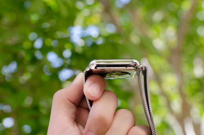
Outside of height and width, the thickness of the watch is definitely a bit more than what one might expect from a regular watch, but it isn’t really all that noticeable due to the rounded curves of the casing. When looking at the display, the display’s cover glass also blends seamlessly into the metal case of the watch, which really looks impressive indoors, although the illusion is somewhat lost in strong sunlight as it becomes obvious where the display ends and the bezel begins. This really helps with analog watchfaces, but in practice I found I was never really bothered by rectangular watch displays. If anything, I’ve found round watch display to lack information density; round watch displays just aren’t pragmatic for general purpose computing.
In order to really give a sense of what the watch looks and feels like when it’s on the wrist, I’m going to start by assuming that most people will wear this watch on their left hand. This places the side button and digital crown on the right. If you read nothing else in this entire article, you should know that the digital crown is probably the best solution I’ve seen to the smartwatch input problem yet. The digital crown manages to have just the right amount of friction to the knob so input feels deliberate without being difficult. The notches that surround the crown really help with gripping the crown and improve the precision of input with the digital crown. Both the digital crown and side button have a solid, clicky action, but it’s probably not a surprise at this point given that Apple seems to consistently nail down details like button feel on their iPads and iPhones.
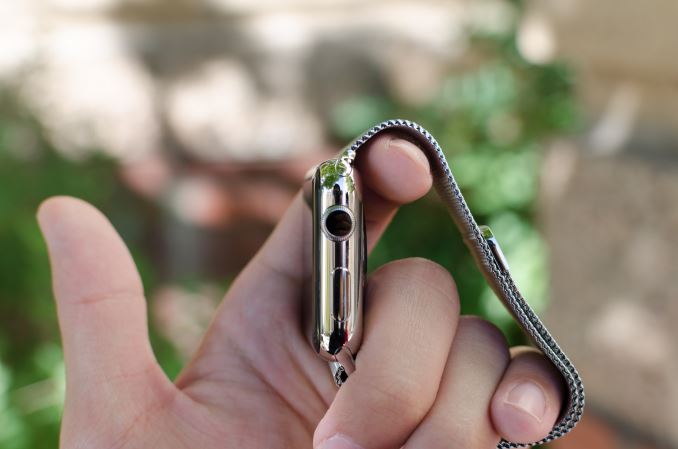
On the left side of the watch, the only notable interruptions are the speaker and microphone holes. As far as I can tell there’s only a single microphone hole, but it seems that Apple has some form of noise cancellation as background noise is generally well-muffled.
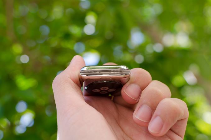
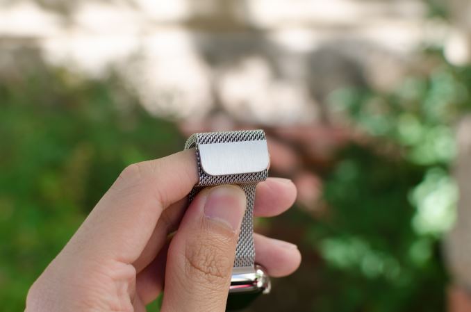
The top and bottom of the watch are just the attachment points for the bands of the watch, but from a design perspective this is probably one of the most crucial. The interchangeable bands work incredibly well because of just how easy it is to attach and detach bands. Attaching a band is as simple as matching with the slot and sliding it in, although it is possible to get it wrong by putting a band in upside-down. The fit and finish of both the Milanese loop and sport band that I received were both essentially perfect here, and the Milanese loop band has a glossy finish on the side that helps the band to blend in with the casing of the watch.
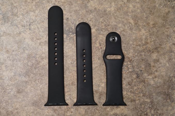
The bands themselves are probably the most important aspect of the Apple Watch's design. While Apple definitely hopes that users will be purchasing bands in addition to the one that comes with their watch, it's a safe bet that most users will be using the fluoroelastomer bands that ship with the Apple Watch Sport and the entry level Apple Watch and Apple Watch Edition models. Because the fluoroelastomer band ships with the Sport version of the watch and has to fit every wrist size the fluoroelastomer band actually is more like one and a half bands. Included in the package is the section of the strap with the metal pin, and two pieces of different lengths with holes in them. The longer one is meant for users with larger wrists, and the smaller one for users with smaller wrists.
As for the band itself, the feel of it can be difficult to describe. When they were first revealed, my initial thought was that they would have a somewhat firm and rubbery feel. It turns out that the bands are very flexible, and also very soft. The best description I could give is that it feels similar to the soft touch back of the black Nexus 5 and Nexus 9, but much smoother and very resistant to smudges. Water also tends to roll right off of it which makes it very well suited to fitness activities. Since it's not infinitely adjustable there's always a small mismatch between the size of the band and the size of your wrist, but there's not much that can be done to solve that with a pin and tuck design.
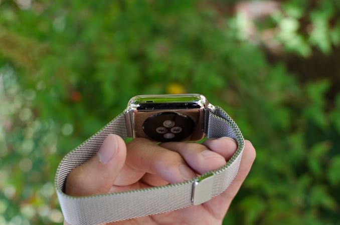
In the case of the Milanese loop, the infinitely adjustable design has basically solved the teething issues I have with wearing most watches. The band manages to deal with the issues I’ve always had with wristbands that always seemed to be either too tight or too loose. The fabric-like pattern of the metal links also helps to distribute pressure while allowing for ventilation, so I don’t feel the need to constantly take off the watch due to trapped sweat or some similar issue. It’s also easy to clean the metal bands if they get dirty, although I suspect the leather bands will be rather difficult to deal with in this regard. There is some potential to pinch hairs, but in my experience this is pretty unlikely and I can count on one hand the number of times I’ve noticed this problem in the past few months. As a result, this is probably the only watch I’ve ever worn that is consistently comfortable regardless of weather conditions. Independent of how good the wearable is from a digital logic/software standpoint, I’ve noticed that these aspects of the design are far, far more crucial than anyone seems to notice. In the case of Apple Watch, the bands are pretty much as good as it gets.
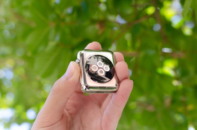
Moving past the bands, the back of the watch is somewhat unremarkable. There’s a rounded crystal that houses the heart rate LEDs and sensors, and serves as an attachment point for the MagSafe wireless charger. In practice, the only notable issue here is that the crystal seems to act as a pressure point when wearing the Watch, but it’s likely that this is done to ensure proper contact for the heart rate monitor.
Overall, Apple has pretty much nailed the design of the watch. The controls are well-executed and placed in a pragmatic position, in a way that I haven’t really seen anyone else achieve yet. The only real objection I have to the design is that the stainless steel casing seems to be a magnet for small scratches. They’re tough to see in most conditions, but with strong lighting it becomes pretty obvious that it’s pretty easy to scratch the watch casing. I suspect the only solution here is to regularly buff out scratches from the casing like most any stainless steel watch. As for the Apple Watch Sport, the 7000 series aluminum seems to hold up to daily use without any sign of scratches or chips on the casing of the watch. At 25g and 30g for the 38mm and 42mm respectively it's also lighter than the 40g and 50g masses of the stainless steel models. Since the Sport edition uses Ion-X glass like the iPhone 6 instead of the Sapphire crystal of the normal Apple Watch and Apple Watch Edition, the display cover glass is much more susceptible to scratching. While I haven't encountered any scratches at this point, the sapphire glass editions will undoubtedly better stand the test of time.




270 Comments
View All Comments
JoshHo - Tuesday, July 21, 2015 - link
It would be great to get specific instances of overly wordy areas, and information that you have learned elsewhere that is redundant in the review to improve our wearable reviews going forward.Blairh - Monday, July 20, 2015 - link
As an iPhone user I think the notifications aspect of the AW would be very appealing, but Apple is asking for too much money for such a luxury. And I'm talking about the Sport models. The SS models are ridiculously expensive. It's no surprise that roughly 3/4 of all AW sales have been the Sport models. Seriously you are nuts IMO to buy the SS model unless you have money to burn. Plus I think the Sport models are just nicer looking in general. And lighter to boot.Anyways, this review highlights a current glaring weakness which is the inability to respond to IM 3rd party apps directly on the AW. If you use WhatsApp or Facebook Messenger often as I do you are SOL if you want to respond with your AW right now. Perhaps this will change with the 2.0 update come fall, but still, right now this is really only ideal if you main communication is the messages app. Email is another story as there are several 3rd party email clients that offer voice dictation.
I'm waffling between an AW and the Vivosmart. The Vivosmart won't let me reply to any notifications from my wrist however it's a third of the price of the 38mm AW and feels awesome on your wrist.
I do believe in the future of the AW, but right now its got a lot of glaring holes to fill.
nrencoret - Monday, July 20, 2015 - link
The worst article I've ever read on this site by miles. Too many words for nothing insightful. What I find here is a desperate struggle to justify what cannot be justified. As a person who loves the site's content I'm stumped by the horrible mess I have just read just a few points:- Apple has "solved" how a watch has to fit like no other company, traditional (ie. Rolex) or tech focused. That is a simply mindboggling statement.
- The UI/UX is great. The Apple mouse and the iPhone have just one primary button for interacting. The crown, side button and force touch trilogy are the work of a comitee which couldn't settle for a simple means of interacting with a piece of technology. What Apple is best known for is how great they are at removing complexity -"just works" and "boom" come to mind- the reviewers were far to forgiving to all the usabily issues (ie. force touch discoverability). These would have been major issues on any other piece of technology.
- Understanding what it is you get for your money: If you own a jewel like a watch or ring its timeless and has an intangible value. The watch can cost a pretty penny for something that has no better hardware than whats out there. There is no inherent intangible value in the watch because as has been stated in the review there will be future iterations of it, killing the timeles argument. As such, this watch is a piece of technology not jewelery and thus, its way overpriced. Lets just see how many dads give their sons Apple Watches and how those sons give them to theirr own.
- Battery life of a single day for a timepiece is not even remotely acceptable. The Basis Peak, Fitbits and Pebbles may not be as smart but they nail the basic concept of a a time keeping device must do.
- Nowhere was there a real argument of how the current incarnation of the watch is mostly useless without being tethered. Basis Peak comes to mind as how useful a device can be with our without tether.
I could go on, given the amount of sheer nonsense of this review. I'm really dissapointed that this came from Anandtech.
alanpgh1 - Monday, July 20, 2015 - link
Awesome Review... and right on target.I've had an Apple Watch for 2 months, and it continues to be an important and non-intrusive assistant in my life. I seem to learn something new that is helpful all the time.
The only thing I ask the author to consider are these words from your review:
"Finally, "Hey Siri" works well in terms of activation, but it's really kind of disappointing that the hotword detection doesn't work with the display off. I suspect this is due to power requirements as I haven't seen any other wearable have screen-off hotword detection, but it would definitely be great to see such a feature in the future."
It is actually a feature to have the watch only listen for the "Hey Siri" hotword when the arm is lifted.
Otherwise, if listening all the time, the system would have false triggers. Think about it; this way of operation is by design.
Thanks for an excellent and thorough review!
TheRealArdrid - Tuesday, July 21, 2015 - link
Gotta admit: I didn't get past the second page of this review. This is dripping with the feel of an Apple shill piece. Am I really to believe that no other watch in history, including recent smartwatches, properly fit the author's wrist but the Apple Watch, with its amazing Milanese band, magically did? Statements like that completely destroy legitimacy and credibility. Come on man...zodiacfml - Tuesday, July 21, 2015 - link
Their failure is sticking to the old, physical idea of a watch.FunBunny2 - Tuesday, July 21, 2015 - link
-- Their failure is sticking to the old, physical idea of a watch.Yeah, and what would GUIs be without radio buttons, menus, and all of the other analog clones they're built on? Face it: it's just pixels made to look "physical".
Oxford Guy - Tuesday, July 21, 2015 - link
Honestly, I love that Apple is successful. The sound of PC-worshiping heads exploding all over the Internet is amusing. It lifts my spirits on a regular basis.Seriously, people... Apple didn't run over your mother, kill your dog, or beat your sister.
The level of nerd rage over Apple's success really is misplaced. There are far worse things to cry over than yet another big tech firm that dodges taxes and overprices stuff. It's not like Apple is the only one and it's not like society in general doesn't reward that behavior.
I've seen the anti-Apple zealotry for decades. It never changes. It always comes down to whinging about how much Apple charges, along with accusations that only gays, girls, and social-climbing superficial people use the products. In reality, despite their flaws, Apple products have been dependable workhorses for people for a long time, and some of them have been pretty innovative.
The Lisa was a thousand times more innovative than the IBM PC. Apple didn't execute because of some poor management and the sudden spike in DRAM cost (caused by Japanese firms pushing US firms out of the market with price dumping and then colluding to raise prices, as far as I have read). Yes, it was expensive but the platform was a very solid foundation for line of machines. Apple had an office suite, multitasking, protected memory, tool-less design, a bootloader that made it easy to boot from multiple operating systems, and a plethora of other modern features back in '83.
Unfortunately, the Mac was botched because it was turned from what was envisioned to be a $500 computer into a $1000 computer and then into a $2400 computer -- without making the underlying OS robust enough to justify that price or the hardware expandable enough. But, despite that, it had a very efficient GUI and people were willing to put up with bombs and freezes because that GUI was miles nicer to work with than Windows (up until 95 when things almost became as good on Windows, but not quite).
If you think Apple is so fraudulent then start your own company or get a job running one already out there and out-compete them. Then let us know about your success. Until then, find something more productive to do with your time than rant ineffectually on Internet forums.
Oxford Guy - Tuesday, July 21, 2015 - link
As for this product specifically, my advice is to wait for the next iteration that comes with a shrunken process. Apple's first iPad had a relatively short lifespan, rapidly orphaned. I wouldn't want to be stuck with this device if the same thing were to happen. It has generally been the same advice for quite some time: when Apple comes out with a new form factor, wait until version 2.Oxford Guy - Tuesday, July 21, 2015 - link
This even applied to the Mac, come to think of it. Jobs demoed (without telling the audience or the press, of course) a 512k prototype in order to run speech synthesis when he was unveiling the first Mac (128K, not expandable) to the press.