The Apple Watch Review
by Joshua Ho & Brandon Chester on July 20, 2015 8:00 AM EST- Posted in
- Wearables
- Apple
- Mobile
- Apple Watch
Design
With a new form factor comes the need to deeply analyze design, and in the case of a smartwatch it really becomes more important than ever before. Like clothing, watches are deeply personal in a way that smartphones weren’t. The most immediate aspect of the Apple Watch is the size. I’ve used the Moto 360 before, and while I didn’t think it was too big for me, people with smaller wrists can look rather ridiculous wearing the Moto 360 or many other smartwatches. Even in the 42mm variant, the Apple Watch is surprisingly small for a smartwatch. The 38mm variant is definitely sized for people with smaller wrists.
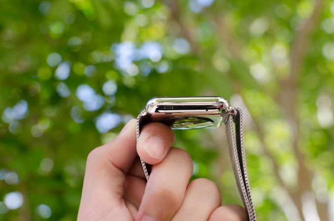
Outside of height and width, the thickness of the watch is definitely a bit more than what one might expect from a regular watch, but it isn’t really all that noticeable due to the rounded curves of the casing. When looking at the display, the display’s cover glass also blends seamlessly into the metal case of the watch, which really looks impressive indoors, although the illusion is somewhat lost in strong sunlight as it becomes obvious where the display ends and the bezel begins. This really helps with analog watchfaces, but in practice I found I was never really bothered by rectangular watch displays. If anything, I’ve found round watch display to lack information density; round watch displays just aren’t pragmatic for general purpose computing.
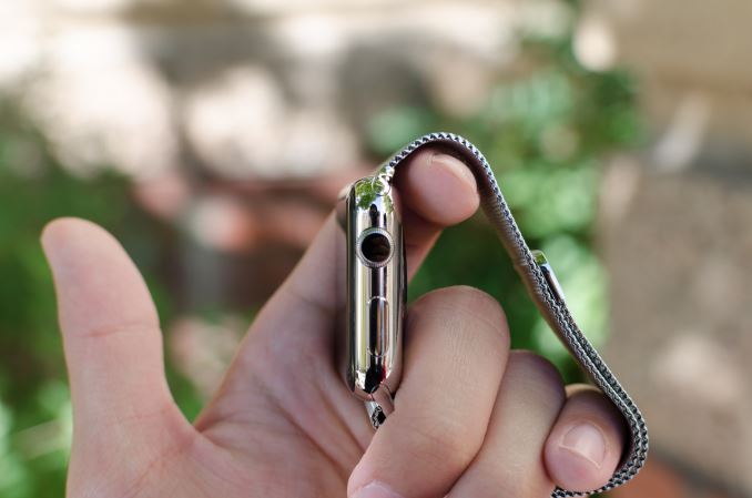
In order to really give a sense of what the watch looks and feels like when it’s on the wrist, I’m going to start by assuming that most people will wear this watch on their left hand. This places the side button and digital crown on the right. If you read nothing else in this entire article, you should know that the digital crown is probably the best solution I’ve seen to the smartwatch input problem yet. The digital crown manages to have just the right amount of friction to the knob so input feels deliberate without being difficult. The notches that surround the crown really help with gripping the crown and improve the precision of input with the digital crown. Both the digital crown and side button have a solid, clicky action, but it’s probably not a surprise at this point given that Apple seems to consistently nail down details like button feel on their iPads and iPhones.
On the left side of the watch, the only notable interruptions are the speaker and microphone holes. As far as I can tell there’s only a single microphone hole, but it seems that Apple has some form of noise cancellation as background noise is generally well-muffled.
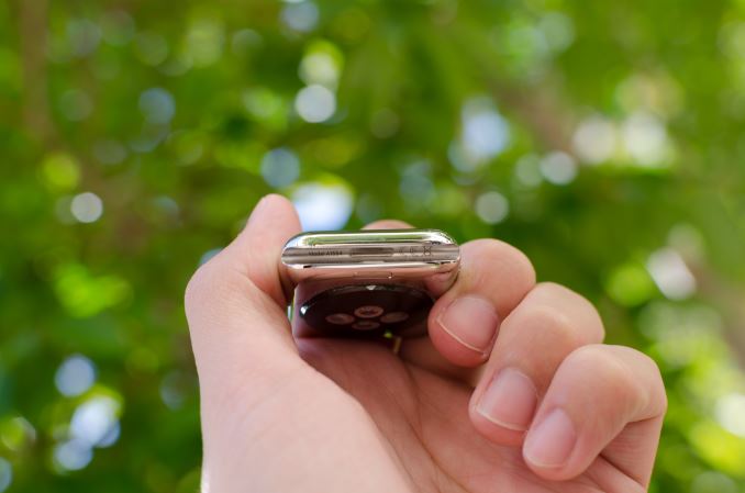
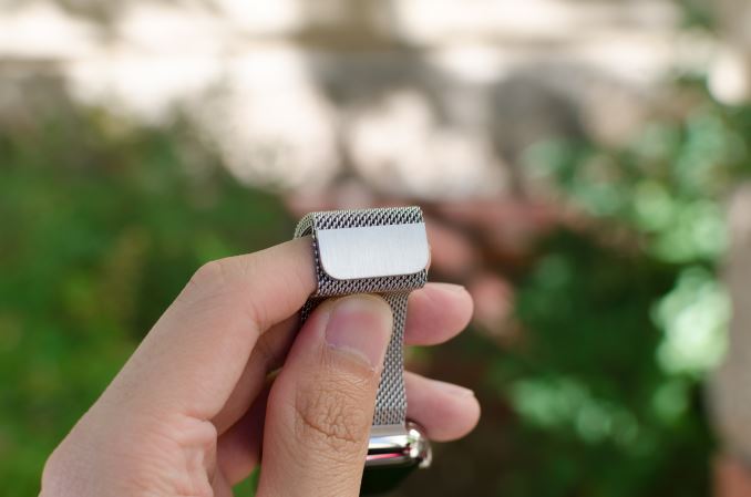
The top and bottom of the watch are just the attachment points for the bands of the watch, but from a design perspective this is probably one of the most crucial. The interchangeable bands work incredibly well because of just how easy it is to attach and detach bands. Attaching a band is as simple as matching with the slot and sliding it in, although it is possible to get it wrong by putting a band in upside-down. The fit and finish of both the Milanese loop and sport band that I received were both essentially perfect here, and the Milanese loop band has a glossy finish on the side that helps the band to blend in with the casing of the watch.
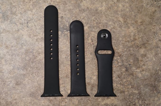
The bands themselves are probably the most important aspect of the Apple Watch's design. While Apple definitely hopes that users will be purchasing bands in addition to the one that comes with their watch, it's a safe bet that most users will be using the fluoroelastomer bands that ship with the Apple Watch Sport and the entry level Apple Watch and Apple Watch Edition models. Because the fluoroelastomer band ships with the Sport version of the watch and has to fit every wrist size the fluoroelastomer band actually is more like one and a half bands. Included in the package is the section of the strap with the metal pin, and two pieces of different lengths with holes in them. The longer one is meant for users with larger wrists, and the smaller one for users with smaller wrists.
As for the band itself, the feel of it can be difficult to describe. When they were first revealed, my initial thought was that they would have a somewhat firm and rubbery feel. It turns out that the bands are very flexible, and also very soft. The best description I could give is that it feels similar to the soft touch back of the black Nexus 5 and Nexus 9, but much smoother and very resistant to smudges. Water also tends to roll right off of it which makes it very well suited to fitness activities. Since it's not infinitely adjustable there's always a small mismatch between the size of the band and the size of your wrist, but there's not much that can be done to solve that with a pin and tuck design.
In the case of the Milanese loop, the infinitely adjustable design has basically solved the teething issues I have with wearing most watches. The band manages to deal with the issues I’ve always had with wristbands that always seemed to be either too tight or too loose. The fabric-like pattern of the metal links also helps to distribute pressure while allowing for ventilation, so I don’t feel the need to constantly take off the watch due to trapped sweat or some similar issue. It’s also easy to clean the metal bands if they get dirty, although I suspect the leather bands will be rather difficult to deal with in this regard. There is some potential to pinch hairs, but in my experience this is pretty unlikely and I can count on one hand the number of times I’ve noticed this problem in the past few months. As a result, this is probably the only watch I’ve ever worn that is consistently comfortable regardless of weather conditions. Independent of how good the wearable is from a digital logic/software standpoint, I’ve noticed that these aspects of the design are far, far more crucial than anyone seems to notice. In the case of Apple Watch, the bands are pretty much as good as it gets.
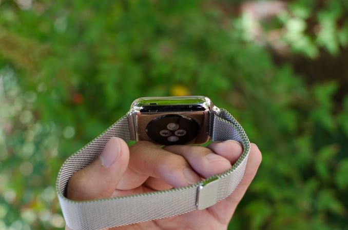
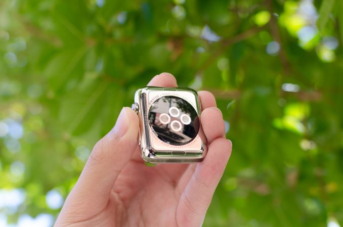
Moving past the bands, the back of the watch is somewhat unremarkable. There’s a rounded crystal that houses the heart rate LEDs and sensors, and serves as an attachment point for the MagSafe wireless charger. In practice, the only notable issue here is that the crystal seems to act as a pressure point when wearing the Watch, but it’s likely that this is done to ensure proper contact for the heart rate monitor.
Overall, Apple has pretty much nailed the design of the watch. The controls are well-executed and placed in a pragmatic position, in a way that I haven’t really seen anyone else achieve yet. The only real objection I have to the design is that the stainless steel casing seems to be a magnet for small scratches. They’re tough to see in most conditions, but with strong lighting it becomes pretty obvious that it’s pretty easy to scratch the watch casing. I suspect the only solution here is to regularly buff out scratches from the casing like most any stainless steel watch. As for the Apple Watch Sport, the 7000 series aluminum seems to hold up to daily use without any sign of scratches or chips on the casing of the watch. At 25g and 30g for the 38mm and 42mm respectively it's also lighter than the 40g and 50g masses of the stainless steel models. Since the Sport edition uses Ion-X glass like the iPhone 6 instead of the Sapphire crystal of the normal Apple Watch and Apple Watch Edition, the display cover glass is much more susceptible to scratching. While I haven't encountered any scratches at this point, the sapphire glass editions will undoubtedly better stand the test of time.




270 Comments
View All Comments
everythingis1 - Tuesday, July 21, 2015 - link
Is anyone going to talk about that fact that these devices need 2 hands to operate. Doesn't that make the entire platform functionally irrelevant as anything other than a simple sensor? Am I completely crazy or is any smartphone, that can be operated with one hand for basic functionality, superior in every single way?deasys - Tuesday, July 21, 2015 - link
Actually, the Apple Watch can be operated 'no hands.' That's what Siri is all about.everythingis1 - Friday, July 24, 2015 - link
How do you activate Siri?Barilla - Tuesday, July 21, 2015 - link
Too bad one of the biggest features separating it from other smartwatches - the digital crown - becomes literally unusable if you decide to wear it on right hand. Yeah, some people do that...name99 - Tuesday, July 21, 2015 - link
LITERALLY unusable?http://www.imore.com/how-set-apple-watch-left-hand...
You mean the scheme Apple devised for this purpose doesn't work? Forgive me if I trust the opinions of various reviewers who have actually tried it over the opinion of someone who's never even touched an Apple watch...
nja4 - Tuesday, July 21, 2015 - link
I'm sort of on the anti-Apple hype train too, where reviewers are seem really expected to give Apple products overly positive reviews. However, I don't expect most people to share my opinions. The polish and appeal is so intense that I would bet most people would prefer their products over others. This review, as Ryan said, is going to be read by more than the core community, and I'm SO happy that Ryan responded in such a positive and discussion-oriented way. You're a great part of this community even when people are jerks about this sort of "obvious Apple bias."uhuznaa - Tuesday, July 21, 2015 - link
Nothing that draws 200 comments on Anandtech can be really pointless... As soon as reviews of Apple products will fizzle out here with five comments or so Apple will have lost it. But not sooner.Really, all you guys seem to be really obsessed with Apple. Even if you hate it, but you do care very much. Most reviews of smart watches draw much fewer comments...
Junereth - Tuesday, July 21, 2015 - link
this site really needs to make comments collapsible. it's incredible hard to navigate in here.SBD.3 - Tuesday, July 21, 2015 - link
I'd love to see the iWatch interface optimized on an iPhone. But as far as wearing a watch again, that ship has sailed.Tams80 - Tuesday, July 21, 2015 - link
A day for a smartwatch is just about bearable, just as it is a smartphone. More battery runtime is always better, but two to three days at moderate usage is the point at which I would be happy (basically, the ability to last a weekend away, where power is not easy to come by). One thing to take into account though, is that the smartphone takes priority. If there is only one charging point, the smartwatch gets left out, and therefore becomes useless.As for the review, I have some issues:
You haven't tried many watches, and by the sounds of it, none to the same extent as the Apple Watch. If that is the case, then I don't think you are qualified to make a comparison to them, as a professional reviewer. Further, you didn't even mention the Alcatel OneTouch Watch; the most apt comparison, as it also works with iPhones. As you clearly spent so much time of this review, you could have at least picked one up. They are cheap, but you also work for the well respected technology site; they might have even sent you one for free!
"The Apple Watch on the other hand doesn’t suffer from discomfort issues at all, and in this regard, Apple has arguably pushed the industry forward."
You do know that there are smartwatches out there that take standard watch straps? You do know that there are countless different designs of standard watch straps?
Finally, two specific points that really grated my gears (especially coming from someone who I expect to technologically knowledgeable):
"The ergonomic annoyances involved with wearing a wristwatch strongly outweighed whatever functionality it provided."
What ergonomic annoyances? The watch goes on your wrist, and in many cases never needs to come off. In return watches tell the time, often the date and day, and sometimes more. How is glancing at a watch less ergonomic than getting your phone out of wherever it is and checking it?
"wireless charging behaves differently from wired charging" - Total fluff, and no shit Sherlock.
So, to summarise. I think that while this was a good technical review of the Apple Watch, as a product review in general, it was very poor. The author let their personal view cloud his judgement too much, and comparisons were, well basically non-existent. If you didn't intend it to be a product review, then remove the product review sections. I expect much better from AnandTech.