HTC Sensation 4G Review - A Sensational Smartphone
by Brian Klug on July 1, 2011 12:38 AM EST- Posted in
- Smartphones
- HTC
- Android
- Mobile
- HTC Sensation
- MSM8260
HTC Sense 3.0
Before we get ahead of ourselves, let’s talk about the other side of HTC’s strategy. I mentioned at the beginning that one half of that is unique industrial design and hardware, the second angle is software differentiation. The Sensation is running Android 2.3.3, but for the most part the angular, contrasty, dark visage of Gingerbread is hidden under a UI skin. That brings us to the oft-maligned HTC Sense, which the Sensation includes the very latest version of, Sense 3.0.
HTC feels very strongly about Sense, and again if you go back in time you can almost understand why. Sense’s earliest relatives helped keep Windows Mobile as a platform afloat, and likewise kept HTC in the business of selling Windows Mobile phones until Android became the obvious next step. Along those lines, handset makers are scared to death of Android commoditization, and like it or hate it, UI skins are one superficial way of preventing that. On a higher level, HTC strongly believes that Sense makes the Android experience easier and more user friendly for ordinary smartphone shoppers.
I used to be staunchly against UI skinning (and for the most part I still am) but Sense 3.0 finally adds some things that I think go beyond just being eye candy that woos in ordinary smartphone shoppers. Those features are namely things like Sense 3.0 lock screen informatics and shortcuts, and htcsense.com features. I've put together a video with all the important changes which you can watch, or just read everything below.
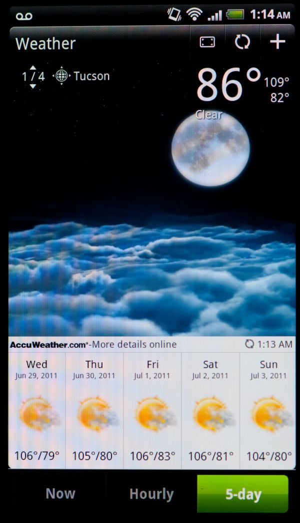
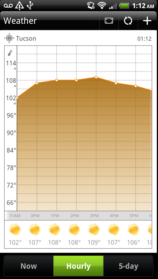
For the most part, HTC Sense 3.0 is very similar to its predecessor. There are a number of minor changes, such as a face-lift for the clock widget which includes a ton more detail inside the Sense weather app. First is an animated overview with current conditions. Tapping on the upper right icon exposes more detail with information details including hourly and 5-day views. The hourly view is especially cool, as it shows a graph of predicted temperature.
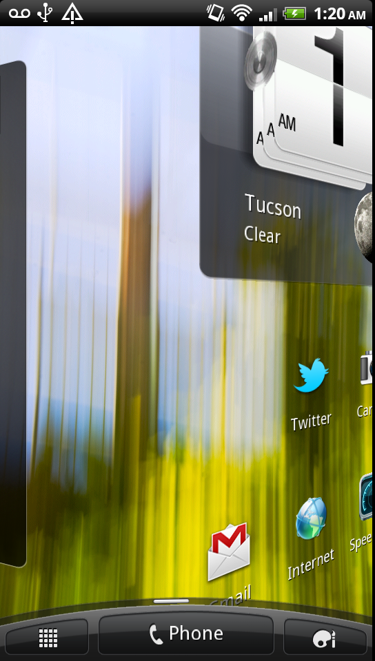
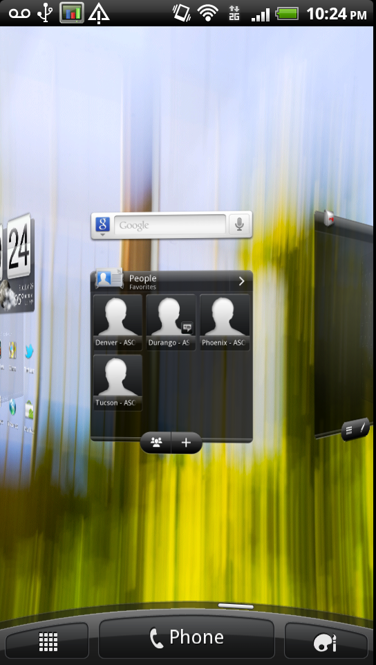
The homescreen and launcher views also get some changes. Homescreens now circularly swirl in after an unlock, and this animation is impressively smooth. Swiping from the left to the right to view different homescreens now results in a 3D cube like animation. It’s like HTC’s own rendition of compiz’s cube desktop switcher.
Swiping fast also results in the whole affair spinning very fast, which seems to be the first thing everyone does when they pick up an HTC Sense 3.0 equipped phone. Framerate is impressively smooth here.
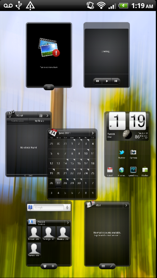
You can now also rearrange homescreen order in the zoomed out view by long-pressing on individual windows. The selected homescreen then snaps around easily.
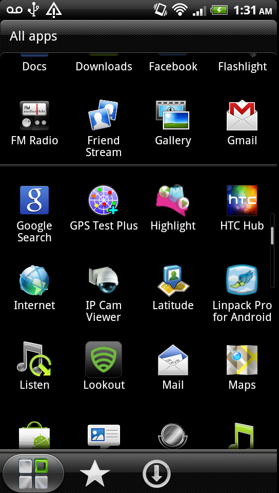
The application launcher also gets some interesting tweaks. First off is probably the most polarizing - scrolling is now done by pages (each comprised of a 4 x 5 grid of icons), instead of in a fluid smooth manner. Swiping up and down slides you through these pages, which get snapped to. I initially hated this, now I’ve gotten used to mentally going to a specific page and then locating an application. There’s no way to disable this, which is the thing I think will enrage some people.
The other major change are the three icons at the bottom, which act like tabs. The first is just the default application view, which can be sorted by alphabet or date. The next sorts applications by launch frequency, and the final one is simply a list of downloaded applications.
I’m intrigued by the frequent view, which after training makes a lot of sense for speeding up getting into the applications that matter most. To be honest, I feel like that’s a lot of what HTC was targeting with Sense 3.0 - to reduce friction in places and implement things that have been popping up in lots of custom ROMs.
Next up is the notifications shade, which gets a side-swipeable list of recent applications. Down below that is the normal notifications area.
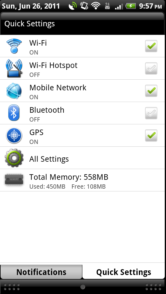
At the bottom however is a new tab - Quick Settings. Ice Cream Sandwich will indubitably bring this into mainline smartphone Android, as it essentially already exists in Honeycomb. Regardless, tap on this and you get a way to quickly toggle a things like WiFi, GPS, and Bluetooth. I’d like to see airplane mode, a brightness slider, and screen rotation in here, but alas nothing is perfect.
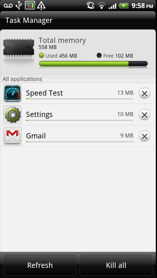
Tapping on task manager brings you into a Sense-themed task killer with total memory and individual applications. It’s probably one of the cleaner and most actionable task killers I’ve seen in a while.
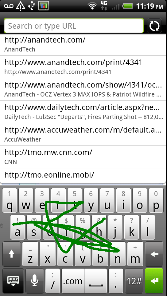
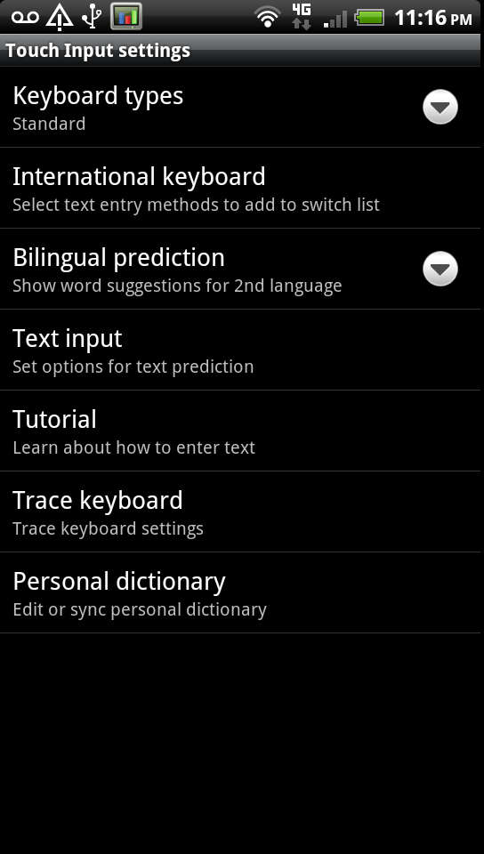
HTC also changed up its IME keyboard, which now includes something very similar to swype by default. Did I say similar? I meant exactly the same, but HTC calls it the “trace” keyboard.
You don’t need to change modes either, and the keyboard still works as well as it did for normal tap typing.
Messaging also gets a facelift with a new theme that gives messages a bit of a 3D pop. It’s nice to see people going beyond emulating the iPhone 4’s glossy bubble threaded messaging style with something else. I like what HTC has done here, and the font size doesn’t make it impossibly challenging to read a long discussion.

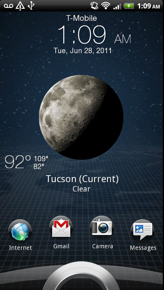
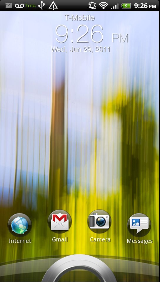
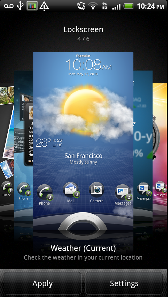
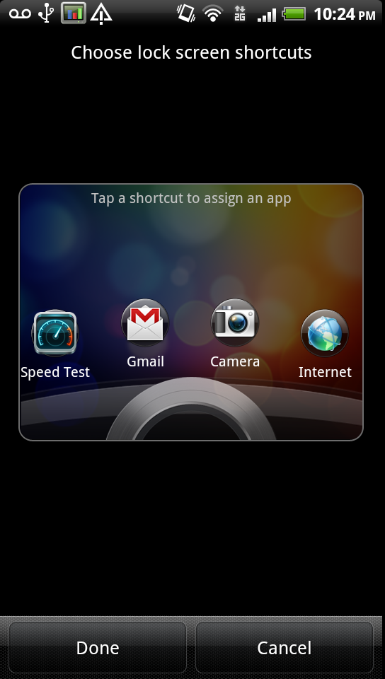
I’ve saved my two favorite features for last, ones that I’ve already slightly touched on. The first is informational lock screens. Head into personalize, tap on lock screen, and you can select from six different lock screens: a wallpaper, photo album, friend stream, current weather, stocks, and another clock. I opted for weather most of the time. Tap settings, and you can change the lock screen shortcuts to any app you desire.
Back on the lock screen, dragging these to the ring results in the phone unlocking and launching the selected application. This makes a ton of sense, and makes it easy to get into most frequent apps like messages and camera. It’s a feature I think HTC has executed very well.
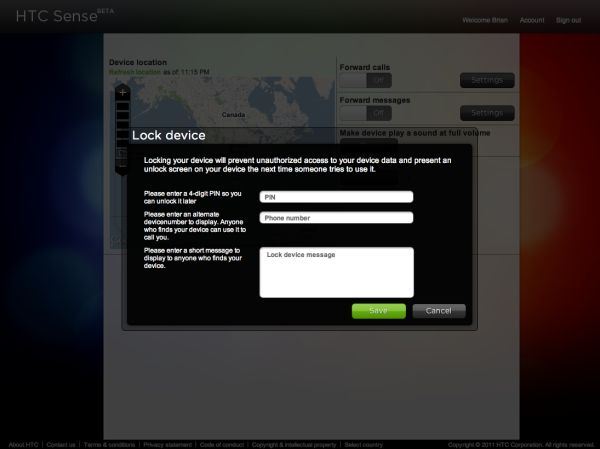
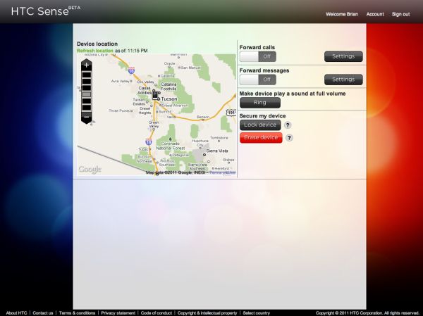
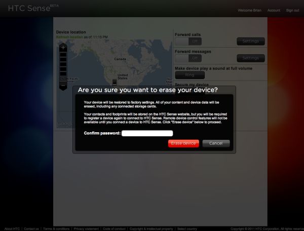
The next one is htcsense.com, which is part backup, part remote device management. Similar to Find My iPhone, you can remotely lock, erase, and ring the phone.
I tried all three and found that they do indeed work, and impressively enough remote wipe does include a full format of the SD card. It does require decent connectivity for things to happen quickly - if signal is marginal, it can take a while for anything here to push through.
There’s also a map with the device’s location on top of google maps, and some toggles for forwarding messages and calls. I suppose that makes sense if you’ve lost the phone or just want the convenience.
I fear that htcsense.com won’t see super high attach rates because it isn’t part of the initial setup wizard in the way it should be. On other devices like the Inspire 4G (htcsense.com isn’t really a 3.0 feature, but bears going over) initial setup prompts you to create an account and explains what all having one affords you. On the Sensation with T-Mobile’s build, you have to go into the HTC Hub, get prompted, then setup and log into your account. I wasn’t ever asked unless I went and found it directly.
I think skins like Sense have a place as long as it can offer features beyond just being eye candy. Sense 3.0 adds some features that do enhance usability out of the box, although to be honest you can get the same thing with a custom ROM or by assembling it yourself. That brings me to my final thoughts about Sense. For the majority of people, Sense does make a lot of, well, sense. For power users that want it removed, there should be an option, or at the very least an unlockable bootloader so custom ROMs can be flashed on. HTC has promised to make the second a reality, though the Sensation as it is right now doesn’t fastboot oem unlock, trust me, I tried. This will hopefully come in a later update.







107 Comments
View All Comments
GrizzledYoungMan - Friday, July 1, 2011 - link
And did you nail her or what?Brian Klug - Friday, July 1, 2011 - link
I'm not even sure how to respond, lol. She's my GF ;)-Brian
prophet001 - Friday, July 1, 2011 - link
what a screwed up baseless commentseapeople - Saturday, July 2, 2011 - link
It actually wasn't baseless. His comment was inspired by a picture in the article. You should read more closely.yelped - Friday, July 1, 2011 - link
You left you cellphone number on the Sense 3.0 page, on the notification screenshot under voicemail. :)Brian Klug - Friday, July 1, 2011 - link
That's not actually my number, just this loaner device ;)-Brian
yelped - Friday, July 1, 2011 - link
Good :) When do you think Anand will be ready with his Evo 3d review? Also, do you know if there is a HTC phone with a hardware keyboard based on the Qualcomm 8660 being released soon on Sprint?Thanks!
Brian Klug - Friday, July 1, 2011 - link
Anand will finish up the EVO 3D review next week most likely. He's been under the weather this week, but next is the target.I honestly don't know about an MSM8660 based phone with keyboard coming soon. MSM8260 on T-Mobile with keyboard is coming with the MyTouch 4G Slide though.
-Brian
Pratheek - Friday, July 1, 2011 - link
Since qHD will soon be the default resolution in high end smartphones, I would like to see how qHD S-LCD fares with qHD (SAMOLED+) with RGB stripe layout with slight adjustment in maximum brightness & white point levels...iamkyle - Friday, July 1, 2011 - link
Pics or it didn't happen ;)