OPPO Find 5 Review
by Vivek Gowri on May 29, 2013 6:55 AM EST- Posted in
- Smartphones
- Qualcomm
- Mobile
- APQ8064
- OPPO Find 5
The Android landscape of today is dominated by a handful of different product lines - Galaxy, Nexus, One, Optimus - both in terms of marketshare as well as mindshare. So it’s nice to be sent a smartphone from a smaller device OEM, particularly one with top shelf specs, a good design, and an interesting plan for actually selling it.
And such arrives the OPPO Find 5. The 5 in the name refers to the 5” 1080p display, which you’ll notice is roughly the same as what you’ll find in the HTC Butterfly and Droid DNA, Sony’s Xperia Z and ZL, the ASUS Padfone Infinity, and a handful of other notable devices from ZTE (Grand S), Huawei (Ascend D2), and LG (Optimus G Pro, Japanese variant). And like the HTC and Sony handsets, the Find 5 comes with Qualcomm’s APQ 8064 SoC, which features four Krait cores clocked at 1.5GHz and an Adreno 320 GPU. Also exciting is the pentaband DC-HSPA+ and the fact that OPPO is offering the Find 5 up for sale on their website in fully unlocked, contract-free form (third-party resellers are also selling it on Amazon). Pricing starts at $499 for the 16GB model, with a 32GB SKU commanding an extra $70. On paper, this is a device that I’ve been excited for since I caught wind of it late last year.
Brief history lesson time. OPPO Mobile has made exactly one smartphone in the past: the Finder, which was a pretty interesting phone in its own right. That device’s main claim to fame was its 6.65mm frame, which was paired with a Snapdragon MSM8260 SoC and a Samsung-sourced 4.3” SAMOLED+ display (roughly the same panel as the international Galaxy S2) to create a nice looking and well rounded handset, albeit one that received almost no attention in the western hemisphere. It was never marketed or officially sold here, so that’s not a surprise. The Find 5, on the other hand, is meant to be a global handset, with real US and EU distribution centers and full international support from OPPO. It even went up for sale on Amazon in mid-March and got an official European launch this past Monday.
From a silicon standpoint, the Find 5 isn’t on the bleeding edge, as we’ve since seen the debut of Snapdragon 600 and devices based around it (Optimus G Pro, Padfone Infinity, Galaxy S4 (US), and the HTC One). Given the relative newness of Snapdragon 600/APQ8064T handsets, I’d consider APQ8064 is still more than respectable - it’s still the second most powerful SoC available in Android phones until the quad A15 SoCs show up in volume shipping handsets. There’s also 2GB of LPDDR2 RAM, 16GB or 32GB of onboard NAND, and a skinned version of Android 4.1.2. The Find 5 uses Sony’s latest 13 megapixel Exmor RS CMOS, with on-sensor HDR for both stills and video, 120fps video recording, and a bright f/2.2 lens. It’s worth noting that there is no LTE on-board, meaning that the Find 5 is only really useful if you’re not near AT&T or T-Mobile LTE. This still describes plenty of T-Mobile users though, and paired with WCDMA on the AWS band, the Find 5 is a pretty attractive piece of high end hardware.
| OPPO Find 5 Specifications | ||||
| Device | OPPO Find 5 | |||
| SoC |
1.5 GHz Snapdragon S4 Pro (APQ8064 - 4 x Krait 200 CPU, Adreno 320 GPU) |
|||
| RAM/NAND/Expansion | 2GB LPDDR2, 16/32 GB NAND | |||
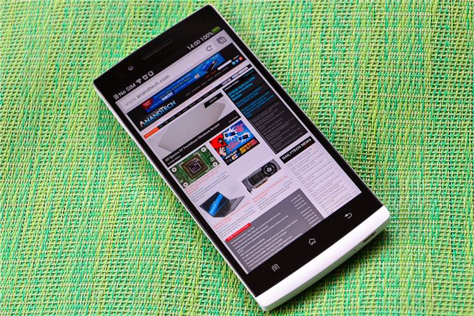
| Display | 5.0-inch LCD IPS 1080p, 443 ppi | |||
| Network | 2G / 3G / 4G DC-HSPA+ (Qualcomm MDM8215) | |||
| Dimensions | 141.8 x 68.8 x 8.9mm max, 165 grams | |||
| Camera | 13.0 MP (4208 × 3120) Rear Facing with 1.12 µm pixels, 1/3.06" CMOS size, F/2.2, 22.85mm (35mm effective), 1.9MP (1080p) front facing | |||
| Battery | 2500 mAh (9.5 Whr) | |||
| OS | Android 4.1.1 with custom OPPO UI | |||
| Connectivity | 802.11a/b/g/n + BT 4.0, USB 2.0, GPS/GNSS, MHL, NFC | |||
But it’s not just the internals - the OPPO is designed really well. Or, as my best friend put it, “This phone looks awesome, especially considering I’ve never heard of it before.” We’ve been talking a lot about smartphone materials recently, both in reviews as well as the podcast and even just conversations between AT staffers on the topic. A lot of it centers around premium feel of materials like aluminum and glass being important to creating a flagship level device today. And the top of the Android market today shows you an interesting contrast in styles - the One is completely aluminum and more polished than any smartphone that doesn’t have a fruit logo, while the Galaxy S4 sticks to the tried and true Samsung method of a wholly plastic device, this time with a thin polycarbonate battery cover similar to SGS3. I’ve been critical of Samsung’s design direction in the past, and I firmly believe the S3 and S4 just don’t feel like high end handsets (and really, other than the S2 and original Note, I can’t think of a Samsung flagship that’s felt particularly premium relative to its contemporaries).
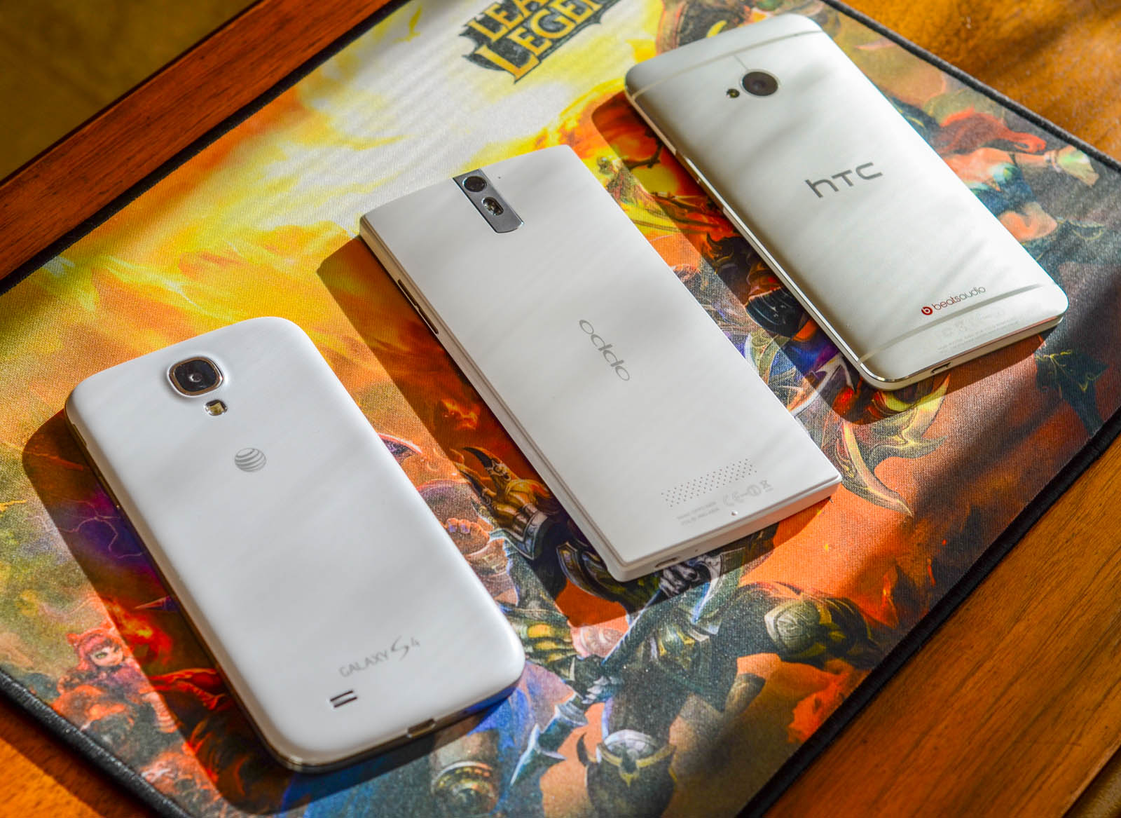
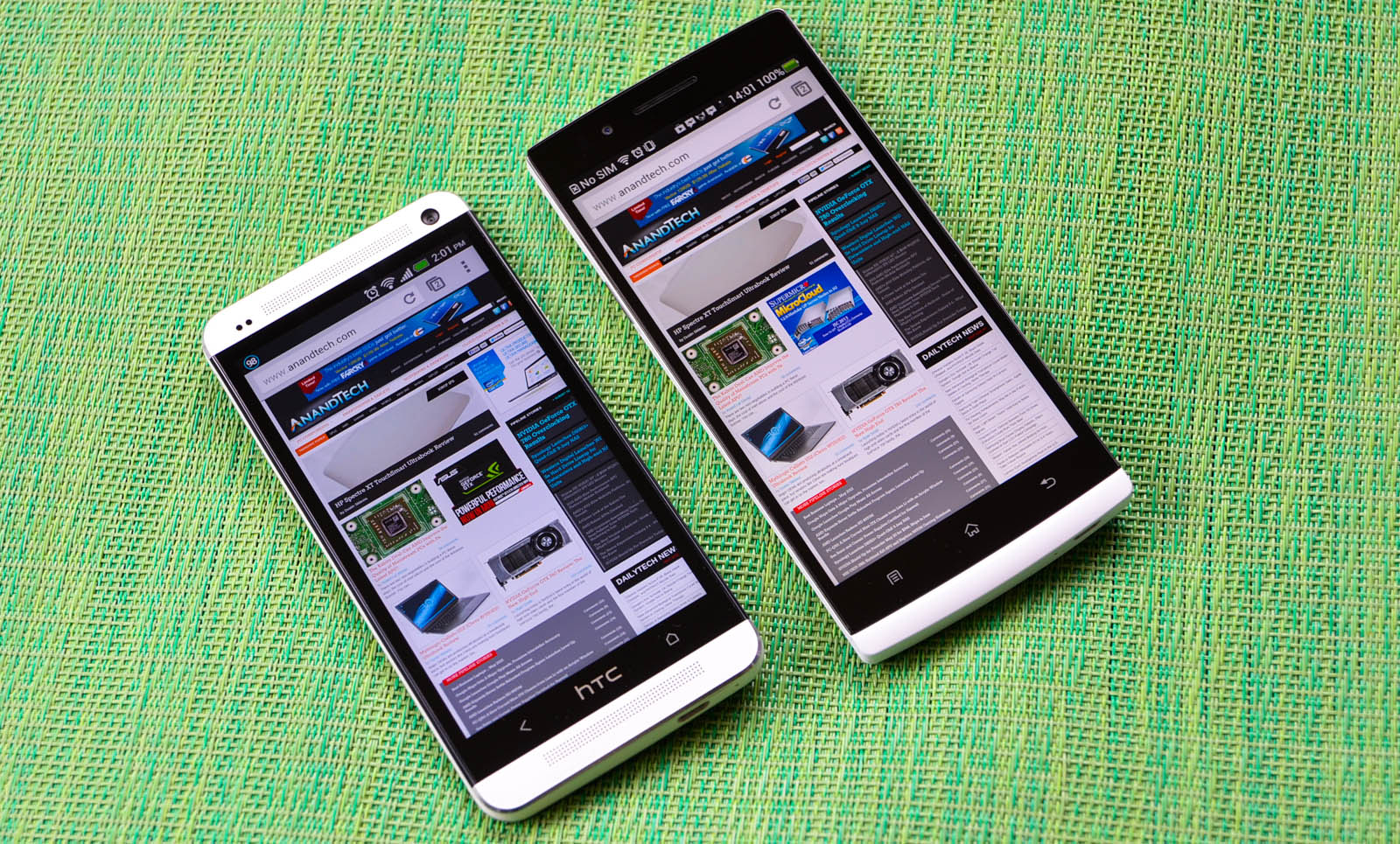
But it’s definitely important to note that it’s more than possible to create a high-end hardware experience using a thermoplastic polymer, a perfect example being the polycarbonate designs Nokia has been putting out for the last two years with great results. The Find 5 isn’t quite there yet, but it’s definitely closer to the Lumia side of things than the Galaxy side of things. Obviously, this comes with a certain amount of additional weight and the Find 5 is a large, hefty brick of a phone. It’s not on the level of the Lumia 920, which is 20% thicker and 20 grams heavier, even though it has a smaller footprint and display; dimensionally, it’s most similar to the HTC Droid DNA (a millimeter taller, two millimeters narrower, a millimeter thinner), except that the OPPO weighs 25g more.


The industrial design is pretty squared off, and in combination with the extra weight it really does feel like a brick in your hands. The white polycarbonate unibody is solid, and is actually somewhat reminiscent of Nokia’s recent efforts. The design language really seems to take inspiration from both Nokia and Sony’s Xperia line, both in terms of look and feel the handset I’ve thought of most has been the Xperia S from last year, though the 920 isn’t far behind. Considering how much I liked the industrial design language of the 2012 Sony devices, that’s a very good thing. Regardless of the flaws those devices had (silicon, software), they were aesthetically and ergonomically very well done.
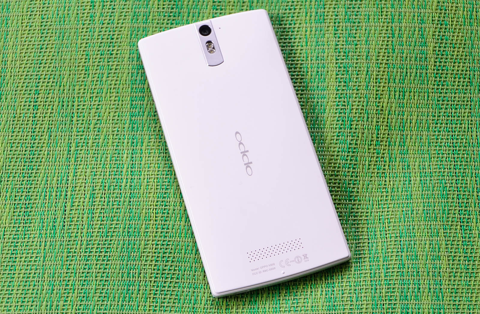
The front face of the Oppo is almost entirely covered by a single piece of glass that goes edge to edge in three directions, with a half centimeter of the plastic unibody exposed at the bottom. The top edge and bottom edge have a mild curvature, as does the back of the device. The back is pretty clean, with a small aluminum camera surround and discreet OPPO badging being the only real features, along with the speaker and FCC logos at the bottom. The aluminum piece is brushed and not polished like Nokia, thankfully, so you don’t need to worry about scratching it. The back and sides meet in an interesting ogee edge profile that goes all the way around the edge. Ogee refers to an S-shaped double curve, sometimes found in kitchen edgework and the like. In the Find 5, the S-profile is squared off, so it feels like the back surface is slightly raised above the edge. It adds a bit of low-key visual and tactile interest, though it’s not really the most refined looking detail in the world.
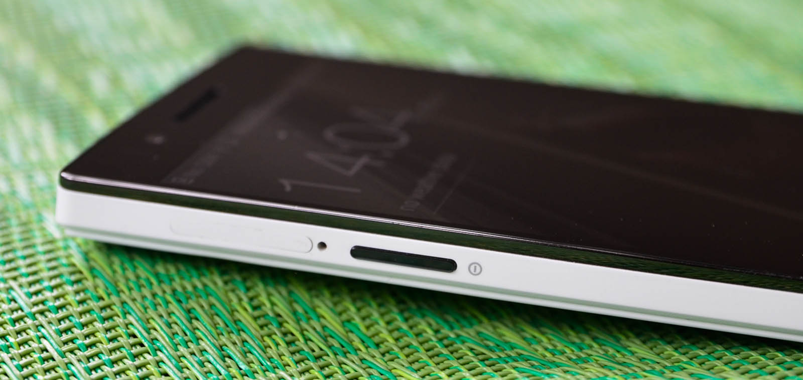
The sides house the usual buttons and ports, though the orientation and layout are a bit odd. The power button is on the left side and volume buttons on the right side, 4/5ths of the way up. Note, this is flipped from how you find it on the current Samsung, Nexus, and Nokia devices (to name a few). Thankfully, pressing the volume keys wakes the display, so as disorienting as the switched buttons are, it’s not a total loss. I’m used to switching between phones and carrying multiple devices with regularity (I am probably almost as bad as Brian in this regard) and typically can adjust between the various button layouts without too much difficulty.
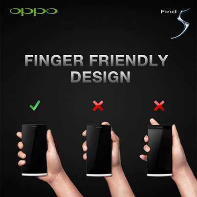
But for some reason, I just couldn’t get get comfortable with the Find 5’s switched buttons, even after a couple of months using the thing. I personally feel like the best button layout is still the one employed by Apple - headphone and power on the top corners, volume on the top left, USB/IO centered on the bottom edge - but the right-side power button is pretty natural now after years of various Samsung devices and the Nexus 4. This is just something else entirely; OPPO touts it as finger-friendly design, even going to their Facebook page to champion the ergonomic decision, but I’m just going to call it counter-intuitive to anyone who is familiar with using a smartphone. I don’t think I’ve ever used a phone with a similar layout and just between you and me, I’ve owned or used almost all of the relevant smartphones released over the past 36 months.
The headphone jack is at the top left corner, the micro-USB on the bottom right, and three capacitive buttons (menu, home, and back) underneath the screen. I still don’t like the inclusion of the menu button, but developers haven’t fully moved to a soft action overflow key, so the hardware menu button still has a place in modern Android devices. The left side power button is the chief ergonomic offender though, without question. I don’t understand why that was thought of as a good idea by anyone on the product design team.
The speaker, as mentioned, is on the back, located near the bottom. It’s loud, much more so than devices like the Nexus 4 or Galaxy S3/S4, but very tinny. And the stereo speakers on the HTC One are just an unfair comparison in terms of speakerphone quality. The vibration module is also pretty harsh, and can cause the phone to rattle in a manner that sounds a bit cheap. These are really nitpicky issues, but it’s really things like this that remind you how much attention to detail matters in offering a truly premium hardware experience.
Overall though, other than the slightly odd ergonomics, the OPPO hardware is pretty impressive, both in terms of size as well as general competence. It wasn’t something I expected to like nearly as much prior to actually getting one, so I was pleasantly surprised. But the OPPO is solid, and the weighty in-hand feel lends an air of quality to the hardware that’s sometimes hard to find in Android handsets, no matter how highly specced.


39 Comments
View All Comments
Kristian Vättö - Wednesday, May 29, 2013 - link
I agree with you on the button layout. Power button on the side design might be okay if you're right-handed as your thumb can easily reach the button but I can say from experience that it's awful if you're left-handed (like me). Given the size of the current phones, it's very, very hard to securely reach the power button with your left index finger - but I'd have no problems if the button was placed on the top of the device.That said, I know left-handed people are the minority and most designs ignore us, but I'm pretty sure there are scenarios when right-handed people use their phone with their left hand. Or at least I use my Nexus 4 with my right hand by time to time (e.g. while driving).
kondamin - Wednesday, May 29, 2013 - link
Powerbutton on the top of the device or the bottom is the way to do it. I'm constanly chaning the volume when I turn my s3 off because of that moronic idea of putting them on oposing sides.And you are spot on that these devices aren't friendly for left handed people, the biggest sinner in my book is nokia their lumia buttons are all on the same (and wrong) side.
JPForums - Wednesday, May 29, 2013 - link
I'm mostly ambidextrous, but I'm always using my Lumia 920 with my left hand. I have no trouble using it with my right either (just switch to operating the buttons with my thumb), but I find more often than not, I pick it up and operate it with my left hand. On that note, I suspect I'd get used to the OPPO button placement fairly quickly as well (even if it isn't ideal). I'm guessing you don't much care for operating your phone buttons with your fingers. I do agree with you that putting the power and volume rocker on opposite sides is a generically bad idea, though.mr_tawan - Wednesday, May 29, 2013 - link
I'm kinda like the Galaxy Nexus's button layout. In the other hand, button layout on the Nexus 7 sucks. I constantly press volume button instead of power button.I think the power button on the top is good for smaller phone. For a larger phone (>4.6"), it's should be on either left or right side, and on the opposite side of volume buttons). It's too far to reach the top.
WhiteAdam - Wednesday, May 29, 2013 - link
Love my job, since I've been bringing in $82h… I sit at home, music playing while I work in front of my new iMac that I got now that I'm making it online. (Home more information)http://goo.gl/fDMVb
nancy919 - Wednesday, May 29, 2013 - link
it's realy the easiest work Ive had.mwarner1 - Wednesday, May 29, 2013 - link
I actually prefer having buttons on the side of modern, large screened phones. The idea of having the power button on top is fine for a device the size of an iPhone, but when you are taking about devices with 5+ inch displays, it is rather awkward to reach all the way to the top of the device to press the power button.Zandros - Wednesday, May 29, 2013 - link
As a right-handed person, I'm usually holding my phone with my left hand so my dominant hand is free to do other things (which occasionally consists of stabbing at the screen).Maybe I'm missing something, though, but isn't having the power button on the left site (as in this case) advantageous for thumb use if you're using it with your left hand?
Kristian Vättö - Wednesday, May 29, 2013 - link
Oh, you're right - the power button is on the left side in the OPPO. I just looked at the "Finger Friendly Design" picture and thought that it's on the right side like in my Nexus, haha. At least for me, it would advantageous to have the power button on the left instead.Basically, with the OPPO all the right-handed people go through the same pain as I go through with the Nexus 4.
VivekGowri - Wednesday, May 29, 2013 - link
Yeah the OPPO power button is a nightmare. I am not impressed by their so-called finger friendly design.